Exploring ten important design principles in motion design.
Motion design has always been something I found exciting, and I have decided to give it a shot. Learning motion design for me at this time is to spice up my UX skills and allow me to create better and more fun experiences for my users. And, of course, trust me to document my learnings. I started my motion design journey by following a guide map that a friend who is a badass at motion design created on Twitter. You should check it out if you are also exploring motion design.
I am currently taking the Mograph Mentor’s free course:- Motion Design 101: A Free Kickstart Guide, which has been really fun. I think it is because I am taking it at my own pace as I learn better that way.
Ten design principles are deemed crucial in motion design in the course, and I will explore them briefly in this article. They include rhythm, proportion, variety, emphasis, unity, repetition, alignment, proximity, balance and contrast.
Rhythm uses recurring or repeated elements in intervals to create a sense of movement. It helps you guide your viewers’ eyes to move how you want them to see your design and the experience you want them to have. There are three types of rhythm: regular, flowing and progressive.

Proportion describes how various design elements are sized and scaled in relation to one another with respect to their quantity or degree, thereby creating a sense of harmony. This can also be used to create balance and emphasis in a design.

Variety appreciates beauty in the diversity of elements, and structures in design, whether they are complex or not. How do you add flavor to your design to make it more interesting?

Emphasis captures what a designer wants the viewers to focus on while experiencing a design, using lines, shapes, colour, texture etc. What is the focal point of your design? How do you contrast it with other elements to make it stand out?

Unity creates a sense of belonging among visual elements employed in a design. It is like that friend in a group that ensures that everyone fits into the group perfectly and the group feels complete. Unity can be created through the use of shapes or proximity to send a clearer message.

Repetition means using the same design element multiple times to create a whole. It helps to establish consistency or add emphasis to a design.

Alignment involves arranging visual elements in a design in such a way that it establishes organization, balance and structure. This is one thing I tried to perfect when I started learning UX design.

Proximity, one of the Gestalt principles, means grouping elements closely to establish a relationship in a way that the designer’s message is communicated clearly and in a simple way that our brains can understand.

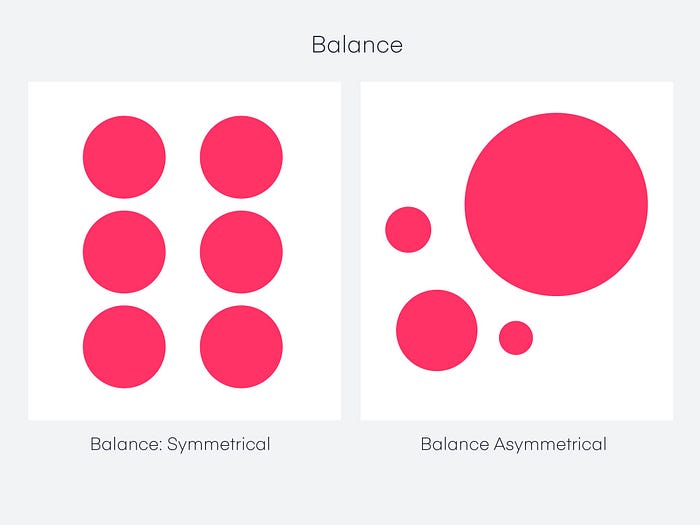
Balance describes the arrangement and distribution of visual elements to establish stability and order in a design. You know how sometimes you take a look at an object and everything just feels right, balance was created. You need to make intentional decisions about the visual weight of the elements in your design. I enjoyed reading this detailed article on balance.

Contrast means creating differences between visual elements to emphasize importance and hierarchy. It is also used to make a design more visually appealing and interesting.

This should give a brief insight on the design principles you need to prioritize if you want to jumpstart a career in motion design. There are more detailed articles online on each of these principles so you should definitely check them out! The course tutor advised to practise drawing representations of these principles on your own so you should do that ! Check mine out!

I should probably write on colour basics next, I had fun learning about it in this course and the Futur’s. Let’s see how it goes! I really hope this article was helpful and enjoyable, see you soon x.
